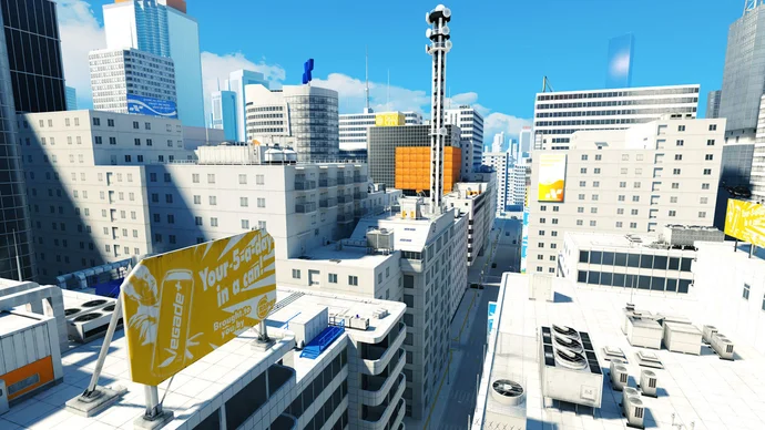
Mirror’s Edge stands out even two decades after its release, with an art style that feels both striking and timeless. Its clean lines, sharp contrasts, and almost minimalist palette create a vision of the future that’s as much about atmosphere as it is design. That look has become iconic, yet the industry never really ran with it, instead favoring grittier, more realistic worlds. What’s surprising is that Mirror’s Edge almost didn’t end up this way at all. Early versions leaned toward something far more conventional—drab, muted, and arguably forgettable. The bright, stark aesthetic we now associate with the game was in large part an accident, born out of necessity and experimentation rather than a clear, intentional blueprint. It’s fascinating how this happy design accident wound up defining the game’s identity, proving that sometimes the best creativity comes from unexpected places.
Source: rockpapershotgun.com